
Product option types
Product option types in Blueprint
When you create or edit a template in Templates, use Add product option to choose the type of field you want customers to use when personalising a product. The Option type you select controls what the customer sees on the storefront and which settings you can configure in the template.
Blueprint uses the label personalisation template throughout the app. Product options are the fields inside that template that collect customer choices, text, numbers, or files.
Some items that were previously listed alongside product options now sit under a separate Elements feature. Elements help you structure and explain a template, but they do not collect customer input.
Available product option types
When you add a product option, Blueprint now includes these product option types:
Checkboxes (yes/no)
Checkboxes (Multi-select)
Radio Buttons
Dropdown List
Text Box
Text Box (Multi-line)
Number input field
File Upload
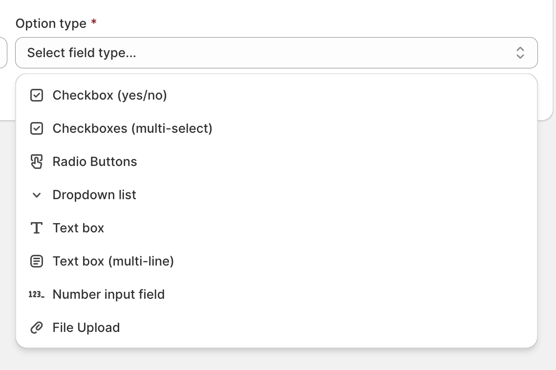
These are the input fields customers can interact with while personalising a product. Use them to collect selections, text, quantities, and uploaded files.
Product Options area
The Product Options area in a template gives you more control over how a personalisation flow is organised.
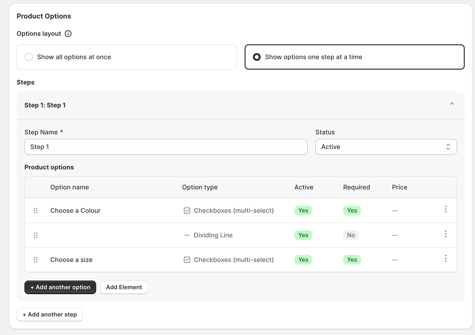
You can choose whether the template should show all options at once or show options one step at a time.
If you use steps, each step includes a step name, status, and a list of items in that step.
Options and elements appear together in the Product options list, so you can build the flow in the exact order customers should see it.
The list shows useful details such as option name, option type, active status, required status, and price.
If you want a simple personalisation form, show all options at once. If you want to guide customers through a longer journey, use the step layout and show options one step at a time.
How to add a product option
Go to Templates and open an existing template or create a new one.
For new templates, click Add product option. For pre-existing templates with options already applied, click Add another option.
Pick the option type you want from the dropdown list.
Enter the option name and complete the configuration shown for that type, including active status, additional price, and any other fields such as required or option values.
Name options the way customers naturally think. For example, use Choose a size, Add gift wrapping, or Enter your engraving text instead of internal or operational labels.
Elements
Elements are separate from product option types. They help you structure the template and add guidance, but they do not ask the customer to make a choice or enter information.
To add one, click Add Element next to Add product option or Add another option in the template builder.
Available elements
Paragraph — Adds supporting text inside the template. Use it to explain what the customer should enter, describe materials or lead times, or provide instructions before a set of options.
Title — Adds a heading inside the template. Use it to separate sections such as Choose your material, Add your message, or Upload your artwork.
Dividing Line — Adds a visual separator between sections. Use it to break up long templates and make related options easier to scan.
Because elements appear in the same Product options list as input fields, you can place them exactly where they should appear in the customer journey.
Option types explained
Checkboxes (yes/no)
Use Checkboxes (yes/no) when the customer only needs to turn one choice on or off.
This works best for simple add-ons or confirmations where there are only two states: selected or not selected.
Practical use case: Add gift wrapping for an extra charge, confirm rush production, or request a printed proof before production.
You can usually configure:
Option name
Additional price
Status
Required when needed
Checkboxes (Multi-select)
Use Checkboxes (Multi-select) when customers can choose more than one value from a list.
This is useful when several selections can apply at the same time.
Practical use case: Let customers choose multiple extras such as pockets, embroidery locations, matching accessories, or care add-ons.
You can usually configure:
Option name
Additional price
Status
Required
Option values
Additional price per value
Status per value
For longer lists, you may also see a setting to show option values in a separate picker for a cleaner customer experience.
Radio Buttons
Use Radio Buttons when customers must choose one value from a short list and you want every choice visible straight away.
This makes comparing a few distinct choices quick and easy.
Practical use case: Choose a material finish such as matte, satin, or gloss, or select a product orientation such as portrait or landscape.
You can usually configure:
Option name
Additional price
Status
Required
Option values
Additional price per value
Status per value
Dropdown List
Use Dropdown List when customers must choose one value from a list, especially if the list is longer or you want to save space in the layout.
Practical use case: Choose a size, thread colour, frame option, or packaging style from a list of available values.
You can usually configure:
Option name
Additional price
Status
Required
Option values
Additional price per value
Status per value
If the list is long, a dropdown often keeps the template cleaner than showing every value at once.
Text Box
Use Text Box when customers need to enter a short line of text.
This is best for compact inputs rather than full messages.
Practical use case: Collect a first name for embroidery, a short engraving, initials, or a custom label name.
You can usually configure:
Option name
Additional price
Status
Required
Minimum characters
Maximum characters
Some text-based options may also support extra pricing rules depending on how your template is set up.
Text Box (Multi-line)
Use Text Box (Multi-line) when customers need more space to enter several words, a longer message, or special instructions.
Practical use case: Collect a gift message, detailed engraving instructions, a dedication, or production notes from the customer.
You can usually configure:
Option name
Additional price
Status
Required
This option is helpful when a single-line field would feel too restrictive.
Number input field
Use Number input field when the customer needs to enter a numeric value only.
This helps prevent text being entered where only numbers make sense.
Practical use case: Collect a shirt number, table number, measurement, quantity for a bundled add-on, or another numeric reference.
You can usually configure:
Option name
Additional price
Status
Required
File Upload
Use File Upload when customers need to send artwork, reference material, or another file as part of their order.
Practical use case: Let customers upload a logo for printing, a design reference image, or a document containing personalisation details.
You can usually configure:
Option name
Additional price
Status
Required
If you use File Upload, make the option name very clear so customers know exactly what they should provide, such as Upload your logo or Upload reference image.
Choosing the right option type
Choosing the best option type makes the template easier to complete and reduces incorrect submissions.
Use Checkboxes (yes/no) for a single on/off choice.
Use Checkboxes (Multi-select) when multiple choices can be selected together.
Use Radio Buttons when customers should choose one option from a short, visible list.
Use Dropdown List when customers should choose one option from a longer list or when you want to save space.
Use Text Box for short text such as names, initials, or short engraving copy.
Use Text Box (Multi-line) for longer messages or detailed instructions.
Use Number input field when only numbers should be entered.
Use File Upload when the order depends on artwork, logos, or reference files supplied by the customer.
Use Elements such as Paragraph, Title, and Dividing Line when you need to explain or structure the template instead of collecting input.
If you are deciding between Radio Buttons and Dropdown List, use Radio Buttons when there are only a few important choices to compare quickly, and use Dropdown List when there are many values or limited screen space.
Best practices
Use clear, customer-friendly option names so people know exactly what to enter or select.
Only mark an option as Required when the order cannot move forward without it.
Add Additional price only where it is easy for the customer to understand why the price changes.
Keep lists short and well named. If a list becomes long, consider a Dropdown List instead of showing everything inline.
Use Checkboxes (yes/no) for simple extras, not for choices where customers need several possible values.
Use Checkboxes (Multi-select) only when multiple selections should genuinely be allowed.
Use Radio Buttons for a small set of mutually exclusive options that should stay visible.
Use Text Box for short answers and Text Box (Multi-line) for longer instructions to avoid cramped text entry.
For text-based options, set sensible expectations in the option name, such as character limits or what kind of text should be entered.
Use Number input field only when a numeric answer is required, so customers are not confused about whether words are allowed.
For File Upload, explain what file the customer should upload and what it will be used for.
Use Title, Paragraph, and Dividing Line to break long templates into sections and improve readability.
If your template has many fields, consider showing options one step at a time so the customer is guided through the process more clearly.
Related guide
Learn how to build a template, organise product options, and publish a personalisation flow for your products.